This page is part of the legacy 1.0.x documentation. We recommend using the latest documentation instead.
Spatialize HTML Elements
Basic concept: Spatialized Elements and 3D Container Elements
Because the WebSpatial SDK currently offers only a React SDK, all examples in this document use React.
APIs covered in this section:
enable-xr,__enableXr__,enableXrcursor: pointer
Enable spatialization
With the current WebSpatial SDK, an HTML element must be marked with a temporary flag before you can use any spatial APIs.
In a future W3C specification, we hope that HTML elements won't need to be explicitly marked as spatial to use spatial APIs - just using a spatial API should implicitly make them spatialized HTML elements. For now the flag is required for performance and other practical reasons.
You can apply the flag in three ways:
- Add the attribute
enable-xrto the element.
<div className="card" enable-xr>
- Add
__enableXr__to the element's class name.
<div className="card __enableXr__">
- Add
enableXr: truein the element's inline style.
<div className="card" style={{ enableXr: true, marginTop: '10px' }}>
Supporting all three options lets you work with a wide range of third-party component libraries.
Most component libraries let you customize things like attributes, className, or style on internal HTML elements for styling. As long as you have access to any of these, you can pass in the special marker to spatialize the element inside the component.
Example 1:
// third-party component
const Button = ({ children, className, style, ...rest }) => {
  return (
    <button
      className={`default-button ${className || ""}`}
      style={{ backgroundColor: "blue", color: "white", ...style }}
      {...rest}>
      {children}
    </button>
  );
};

// usage
<Button
  className="custom-btn __enableXr__"
  style={{ fontSize: "14px", enableXr: true }}
  data-testid="submit-btn"
  enable-xr>
  Submit
</Button>;
Example 2:
// third-party component
const Card = ({ children, headerClassName, headerStyle, headerProps }) => {
  return (
    <div className="card">
      <div
        className={`card-header ${headerClassName || ""}`}
        style={headerStyle}
        {...headerProps}>
        Card Title
      </div>
      <div className="card-body">{children}</div>
    </div>
  );
};

// usage
<Card
  headerClassName="custom-header  __enableXr__"
  headerStyle={{ backgroundColor: "gray", enableXr: true }}
  headerProps={{ "aria-label": "Card Title", "enable-xr": true }}>
  Card Content
</Card>;
After the flag is applied, the element keeps all of its original capabilities and also gains access to the spatial APIs provided by the WebSpatial SDK, including the CSS APIs and DOM APIs described below.
Cross-platform
A spatialized element has spatial capabilities only when running inside the WebSpatial App Shell.
On desktop/mobile platforms and regular browsers, the build output does not include the WebSpatial SDK implementation. Calls to the WebSpatial API are removed automatically, and the elements remain ordinary HTML elements in the React DOM.
So when you enable spatialization for an HTML element, you do not need to write any if-else logic, this API is designed to work cross-platform by default.
CSS Capabilities
On a spatialized element, you can use WebSpatial APIs in all common CSS authoring styles, including:
- Embedded Global CSS
import React from 'react';

function App() {
  return (
    <div>
      <style>{`
        h1 {
          --xr-background-material: translucent;
        }
      `}</style>
      <h1
        enable-xr
      >Hello World</h1>
- Linked Global CSS
import React from 'react';
import './styles.css';

function App() {
  return (
    <div>
      <h1
        enable-xr
      >Hello World</h1>
h1 {
  --xr-background-material: translucent;
}
- Inline CSS
import React from 'react';

function App() {
  return (
    <div>
      <h1
        style={{
          '--xr-background-material': 'translucent'
        }}
        enable-xr
      >Hello World</h1>
- CSS-in-JS solutions that dynamically change global styles, like styled-components.
const StyledTitle = styled.h1`
  --xr-background-material: translucent;
`
function App() {
  return (
    <div>
      <StyledTitle
        enable-xr
      >Hello World</h1>
CSS Modules, PostCSS, and other pre-compiled CSS pipelines work as well.
DOM Capabilities
If you bypass React and manipulate the spatialized element directly through querySelector or similar DOM APIs, the WebSpatial API will not work correctly.
Instead, obtain the DOM node of the spatialized element via React's Ref API, for example:
import React from 'react';

function App() {
  const ref = useRef(null)
  return (
    <div>
      <h1
        ref={ref}
        className="title"
        style={{
          position: 'relative',
          '--xr-back': '100'
        }}
        enable-xr
      >Hello World</h1>
You can then read or write --xr-back through ref.current.style, or remove it with ref.current.style.removeProperty.
You can also modify ref.current.className as needed.
Animation Capabilities
The WebSpatial SDK does not yet support using spatial APIs inside pure CSS animations.
You can create animations with JS animations. For example, using the Ref API and DOM API mentioned earlier to update WebSpatial styles frame by frame.
The following JS animation libraries have been tested:
- Popmotion
- React Spring
- GSAP
- Tween.js
- Anime.js
Internal Content Interaction
Whether or not an element itself is spatialized, its child-element interactions on spatial-computing platforms such as visionOS are based on natural interaction.
Most of the natural interactions work like touch interactions. One key difference is that during indirect interaction (eye-hand interaction) an element must qualify as an Interaction Region to receive the system-provided Hover Effect.
Hover Effect
During the Select (Navigation) phase - indirect or direct - no JS events fire and no CSS state changes (such as :hover) occur, just like on a touch screen.
So web code can't show any interaction cues at all. Basically, the page has no idea what the user is trying to do at that moment.
For privacy reasons only the operating system knows which element the user's gaze is on or which element the finger is approaching, the web page itself does not.
Instead the operating system (including the browser engine) shows native visual feedback:
- In direct interaction, the motion of the user's finger itself serves as feedback.
- In indirect interaction, the system renders a Hover Effect (for example, a glowing outline floating in front of the element under gaze). This is not the CSS
:hoverstate; it is a native effect.
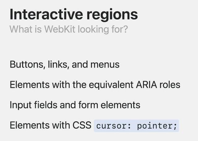
Only elements recognized as Interaction Regions can be targeted and will display the Hover Effect.
An element becomes an Interaction Region if any of the following is true:
- It is a native HTML button, link, or menu element, or any element with an equivalent ARIA role.
- It is an input or form element.
- Otherwise add the CSS property
cursor: pointerto mark any element as an Interaction Region.
JavaScript events
After the Confirm (Activate) phase, indirect and direct interactions fire the same JavaScript events as touch screens:
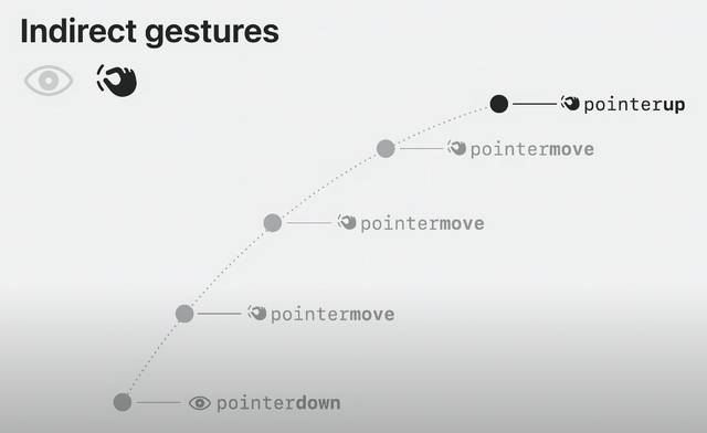
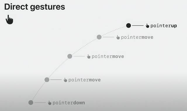
For indirect interaction the sequence is:
- At the moment of the pinch gesture, the system dispatches
pointerover,pointerenter, andpointerdown. - A
touchstartevent is dispatched (touch emulation). - If the fingers stay pinched, moving the hand dispatches:
pointermovetouchmove(touch emulation)
- When the fingers release, the system dispatches
pointerout,pointerleave, andpointerup. - A
touchendevent follows (touch emulation). - For desktop compatibility a series of mouse events is then emulated:
mouseover,mouseenter,mousemove,mousedown,mouseup, and the CSS:hoverstate (cleared when interacting elsewhere). - Finally a
clickevent signifies the confirmed action.
You can build higher-level gestures such as drag-and-drop on top of these low-level events.
Example:

Self interaction
To be added