This page is part of the legacy 1.0.x documentation. We recommend using the latest documentation instead.
Elevate 2D Elements
Basic concepts:
Because the WebSpatial SDK currently offers only a React SDK, all examples in this document use React.
APIs referenced in this section:
position: absolute,position: fixed,position: relative--xr-back
transformtranslateZ(),translate3d()rotateX(),rotateY(),rotate3d()scaleZ(),scale3d()
enable-xr-monitor
When an HTML element has spatialization enabled, it still sits on the web page plane inside a Window Scene, participating in the original HTML/CSS layout flow. Its X and Y positions and dimensions - determined by existing CSS properties and layout rules - remain unchanged.
On top of that baseline, a spatialized HTML element can use the WebSpatial API to move, transform, and lay itself out along the Z-axis in front of the web page plane. This "elevation" brings the web content into 3D space and gives the web page visual depth.
Multiple spatial APIs can achieve this elevation and can be grouped into three categories based on how they affect the layout flow.
Out-of-layout-flow API
This category of APIs makes the HTML element completely leave the normal layout flow, meaning it no longer occupies its original position.
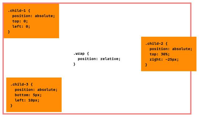
position: absolute
With absolute positioning, the element is positioned relative to the nearest ancestor containing block - an ancestor whose position value is not static, or one that has a transform property. If no such ancestor exists, it is positioned relative to the entire window.
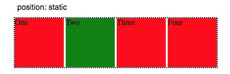
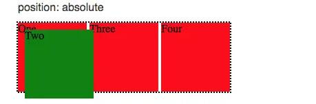
In this mode, there are four CSS properties in the current web standard that let you "move" (position) an element in the four directions along the X and Y axes:
top: moves downward along the Y-axisbottom: moves upward along the Y-axisleft: moves rightward along the X-axisright: moves leftward along the X-axis
The WebSpatial API adds a new CSS property that positions the element along the Z-axis:
--xr-back: moves (positions) forward along the Z-axis
--xr-back accepts unit-less integers that represent distances in native physical-space units (pt, where 1360 pt ≈ 1 meter).
In the current WebSpatial SDK, the value is interpreted relative to the nearest ancestor spatialized element. If none exists, it is relative to the original web page plane. Conceptually:
- If a spatialized element contains another absolutely positioned spatialized element (regardless of intermediate non-spatialized elements), the child's initial Z position is the plane of that ancestor. Think of it as a "back surface" from which
--xr-backmoves forward. - If an absolutely positioned spatialized element has no ancestral spatialized elements, its initial Z position ("back surface") is the web page plane of the entire window scene.
In a future Web standard, a back property should behave like top/bottom/left/right, positioning relative to the nearest containing block.
To keep your WebSpatial code forward-compatible, best practice today is:
If a spatialized element has absolutely positioned spatial children and you want the parent to serve as the Z-axis origin for their positioning, then you should at least set position: relative on the parent (if it's not already absolute or fixed), so it becomes a containing block.
Example based on the Quick Example:
html.is-spatial {
  background-color: transparent;
  --xr-background-material: transparent;
  --xr-background-material: translucent;

  .count-card {
    --xr-background-material: thick;
    position: relative;

    p {
      --xr-background-material: transparent;
      position: absolute;
      bottom: -10px;
      left: 0;
      right: 0;
      --xr-back: 20;
    }
  }
The <p> text is positioned on the Y-axis relative to its containing block .count-card, which is relative.
On the Z-axis, --xr-back also positions the <p> relative to the plane of .count-card, which is both a semi-transparent spatialized element and a containing block.
position: fixed
With fixed positioning, the element is positioned against the initial containing block (effectively the page plane of the window scene) and does not scroll with the page.
Just like absolute positioning, spatialized elements may use the four CSS properties on X and Y and the WebSpatial --xr-back on Z. Note that in this case, the initial Z position is always the web page plane of the window scene.
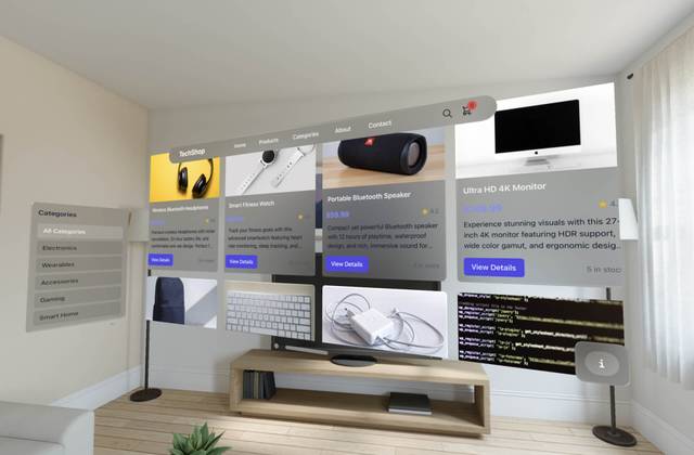
Example from the Techshop demo:
  .navbar {
    @apply mx-auto;
    --xr-background-material: translucent;
    border-radius: 50px;
    width: 1000px;
    position: fixed;
    top: 0;
    left: 0;
    right: 0;
    --xr-back: 50;
  }

  .list-meun {
    position: fixed;
    top: 200px;
    left: 0;
The top bar and side bar are fixed; the product list remains in the page flow. Shrinking the window with the drag handle clips the list, which scrolls, while the top bar and side bar stay in place.
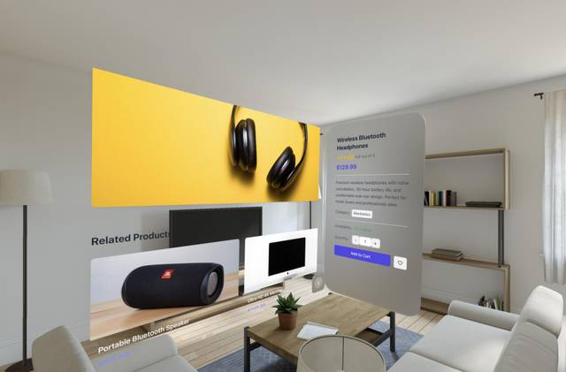
Clicking "View Details" opens a new product-detail window scene:
.product-detail-info {
  --xr-background-material: translucent;
  border-radius: 50px;
  padding: 50px;
  position: fixed;
  top: 0;
  right: 0;
  bottom: 0;
  --xr-back: 20;
  margin: auto;
  width: 400px;
}
While the page scrolls, the left product image scrolls too, but the right info panel remains fixed.
In-layout-flow API
This category of APIs do not affect the normal layout flow. The HTML element still occupies its original space in the layout, and its size is still controlled by the layout flow.
position: relative - change only the position
With relative positioning, the element can move along X and Y using the four CSS properties.
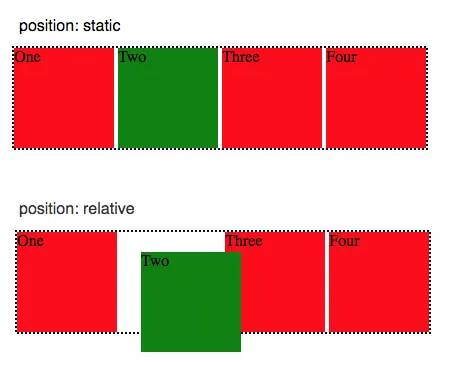
It can also move along Z with --xr-back. The initial Z position is the plane where the element originally sits, which works as the "back surface."
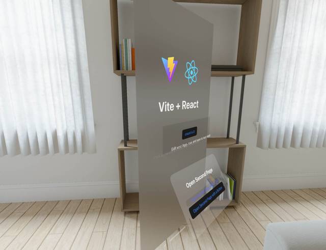
Example based on the Quick Example:
html.is-spatial {
  background-color: transparent;
  --xr-background-material: transparent;
  --xr-background-material: translucent;

  .link-card {
    --xr-background-material: translucent;
    --xr-background-material: thin;
    border-radius: 20px;
    position: relative;
    --xr-back: 50;
    top: 20px;
    transform-origin: top left;
    transform: translateZ(30px) rotateX(30deg);
The .link-card is below .count-card in the original flow. In relative positioning mode, --xr-back moves it 50 units forward along Z while leaving its X/Y position untouched.
Another example from the Quick Example:
.count-card {
  --xr-background-material: thick;
  position: relative;
  --xr-back: 50;

  p {
    --xr-background-material: transparent;
    position: absolute;
    bottom: -10px;
    left: 0;
    right: 0;
    --xr-back: 20;
  }
}
.count-card moves 50 units forward in Z with relative positioning, while keeping its original X and Y position. Inside it, an absolutely positioned <p> moves an additional 20 units forward relative to the .count-card plane.
CSS Transform - change position and shape
CSS Transform leaves the element's original position, size, and layout relations intact, modifying only the rendered image via a matrix.
Standard CSS already allows transforms along all three axes, but depth effects are projected onto the 2D page, meaning the final visual outcome lacks actual spatial depth.
The WebSpatial SDK reuses the existing CSS Transform API. For non-spatial HTML elements, transforms along the Z-axis continue to be projected onto the flat page. But for spatial HTML elements, Z-axis transforms actually move them into 3D space.
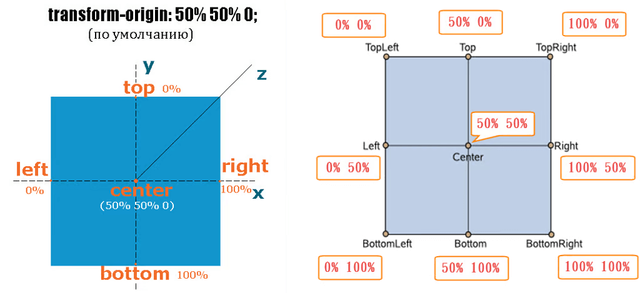
The X/Y/Z origin is always the plane where the element originally sits. transform-origin can shift the origin in X and Y, but never in Z.
Spatialized elements treat that plane as the "back surface," letting the transformed image extend into the space in front.
transform: perspective() becomes unnecessary for spatialized elements since there's no need to define the projection.
Spatial elements support three types of CSS Transform that affect the Z-axis:
translateZ(),translate3d(): displacement. Similar to--xr-back, originating from the back surface.Note that the unit for
translateZ()is still the same as before.rotateX(),rotateY(),rotate3d(): rotation. Rotating around X or Y pushes parts of the element into 3D space.scaleZ(),scale3d(): scaling along Z.
skew is not supported.
Example based on the Quick Example:
html.is-spatial {
  background-color: transparent;
  --xr-background-material: transparent;
  --xr-background-material: translucent;

  .link-card {
    --xr-background-material: translucent;
    --xr-background-material: thin;
    border-radius: 20px;
    position: relative;
    --xr-back: 50;
    top: 20px;
    transform-origin: top left;
    transform: translateZ(30px) rotateX(30deg);
.link-card first moves 50 units forward via --xr-back, then applies a transform: it moves another 30 px forward (automatically converted to pt) and rotates 30 degrees outward around its top edge.
Example from Techshop demo:
.list-meun {
  position: fixed;
  top: 200px;
  left: 0;
  transform-origin: top left;
  transform: translateZ(320px) rotateY(80deg);
}
The side menu is fixed at the far left, then transformed: it moves 320 px forward on Z (converted to pt) and rotates 80 degrees inward around its left edge.

Layout-dependent API
These APIs change the parent's layout flow so that children are laid out from back to front along the Z-axis, assigning Z positions through layout relationships.
They are not yet supported in the current WebSpatial SDK.
Dynamic changes to the layout flow
As noted at the start, once an element is spatialized it still lives in the original layout flow. Its position and size on the X and Y axes - based on regular CSS properties and layout rules - stay the same.
Updates in React may dynamically change CSS and layout, altering a spatialized element's X/Y position or size - whether or not the element is elevated.
WebSpatial SDK automatically detects style changes on the spatialized element itself.
But if a layout change in a parent element causes a spatialized element's X/Y position or size to change, the WebSpatial SDK won't auto-detect those changes yet (for performance reasons)
To handle this, the SDK provides a temporary marker, enable-xr-monitor. Add it to a parent to activate auto-detection. If the parent's styles or internal layout change, WebSpatial will update its spatialized children's X/Y positions and sizes accordingly.
Example:
function CardList() {
  const [showFirstCard, setShowFirstCard] = useState(true);

  const onClick = () => {
    setShowFirstCard(prevState => !prevState);
  };

  return (
    <div enable-xr-monitor>
      {showFirstCard && <div>first card</div>}
      <div enable-xr>second card</div>
      <button onClick={onClick}>toggle</button>
    </div>
  );
}
If "first card" disappears, the spatialized "second card" automatically shifts upward along Y.